Summary
This case study shows how we improved access control in Scaleway’s Object Storage by introducing bucket policies in the console. Until now, users could only create and manage policies through the CLI, using raw JSON. We kept that option, but added a more accessible alternative: a dual-mode interface with a visual form and a code editor.
Our goal was to make access control easier and safer for everyone, regardless of their technical background. This update reduced support requests, closed a key feature gap with competitors, and supported Scaleway’s broader security goals, including ISO 27001 readiness.
Timeline
October 2023 - December 2023
Team
1 Product Designer, 1 Egineering Manager, 1 Product Manager, 1 UX Researcher, 5 Engineers
Role
Sole Designer — led the end-to-end design process: from exploring user needs and benchmarking competitors, to defining priorities, designing the experience, collaborating with engineering, and measuring success after release.
Key results
30% adoption in the first 3 months after release
Cut down access-related support tickets by 60%
Closed a major security gap with competitors
Context
Scaleway’s Object Storage grew in usage, and so did expectations around access control. Users wanted to manage permissions at the bucket level, but the console didn’t support it. Their only option was to write JSON via the CLI—a fragile and inaccessible workaround. This limitation made it harder to secure data and slowed teams down.
What is an object?
What is a bucket, exactly?
What is a bucket policy?
Problem
Managing permissions through the CLI was error-prone and discouraged adoption. It led to misconfigurations, support overhead, and growing frustration from teams who needed something more reliable.
Objectives
Give all users—technical or not—a simple way to manage bucket-level access from the console.
Make access control safer, more transparent, and easier to apply.
On the business side:
Close the gap with competitors
Reduce support requests
Support enterprise needs and security standards
The solution had to be flexible, reliable, and safe by default.
User research
We spoke to users, analyzed support tickets, and reviewed internal research.
From that, we identified three user profiles, based on their level of security maturity:
Low maturity (startups)
Security is handled manually or left to the provider.
Users rely on visual guidance, expect safe defaults, and avoid complexity.
Medium maturity (growing teams)
They need more control and visibility.
Visual tools help, but they want clarity on who has access to what.
High maturity (entreprises)
They manage policies independently.
They expect granular permissions, IAM compatibility, and strong safeguards.
We also saw clear signals in the field:
A high number of support tickets about access errors and permission gaps.
Repeated feedback like: “Can I restrict access to just this bucket?”
Low usage of IAM features in the console.
A public feature request asking for fine-grained API key control.
Across all profiles, the same pain points came back:
Key finding #1
No scoped access
Users couldn’t limit access to a specific bucket or object. That often led to overly permissive setups.
Key finding #2
Fear of making mistakes
Users worried about exposing data or locking themselves out.
Key finding #3
Unclear interfaces led to uncertainty
A lack of guidance made users guess, hesitate, or rely on trial and error.
These insights shaped our solution.
Challenges
We needed to support two very different user profiles: those who preferred writing JSON for full control, and those who relied on a visual form to feel safe and guided. Balancing both created key design challenges around flexibility, clarity, and real-time synchronization.
Keep both modes in sync
Users could switch at any time. We had to keep the data consistent.
Reduce the risk of errors
The policy syntax was strict. Mistakes could block access or expose data.
Design for clarity
The interface needed to stay simple, even for complex rules.
Constraints
Some limitations were outside our control. They shaped what was possible in this first release.
Version limitation
The visual editor only supported one policy version (2023-04-17).
Missing components in the design system
Some UI patterns didn’t exist yet. We made a trade-off: ship a scoped version first, then integrate the reusable component once it was ready.
Tight deadline
We had to deliver a working version quickly, then iterate.
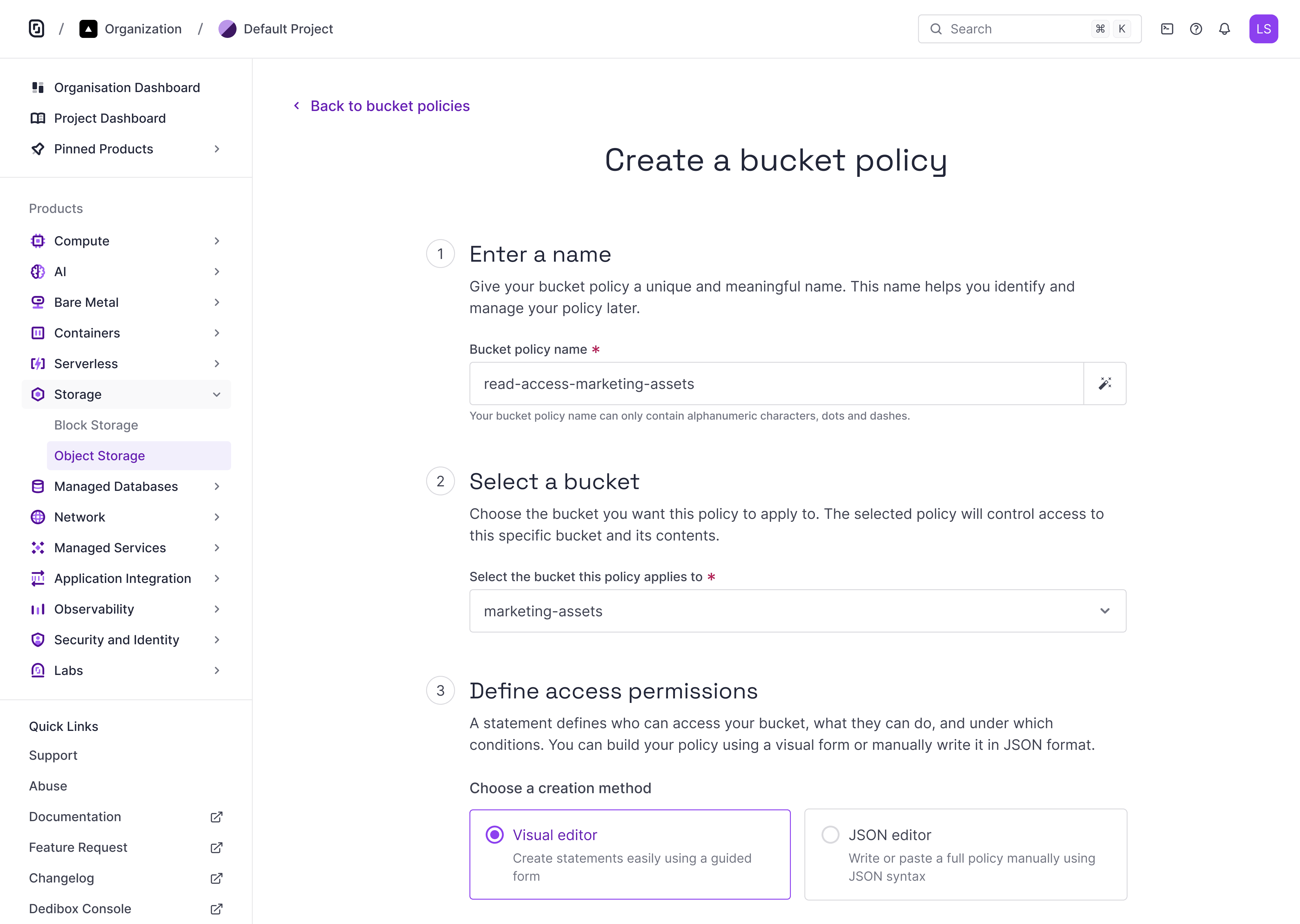
Solution
Bucket policies tab
We introduced a new Bucket Policies tab in the console. Users can now view and manage all policies in one place, with clear links between buckets and policies.
This improves visibility, reduces errors, and builds trust in how access is managed.
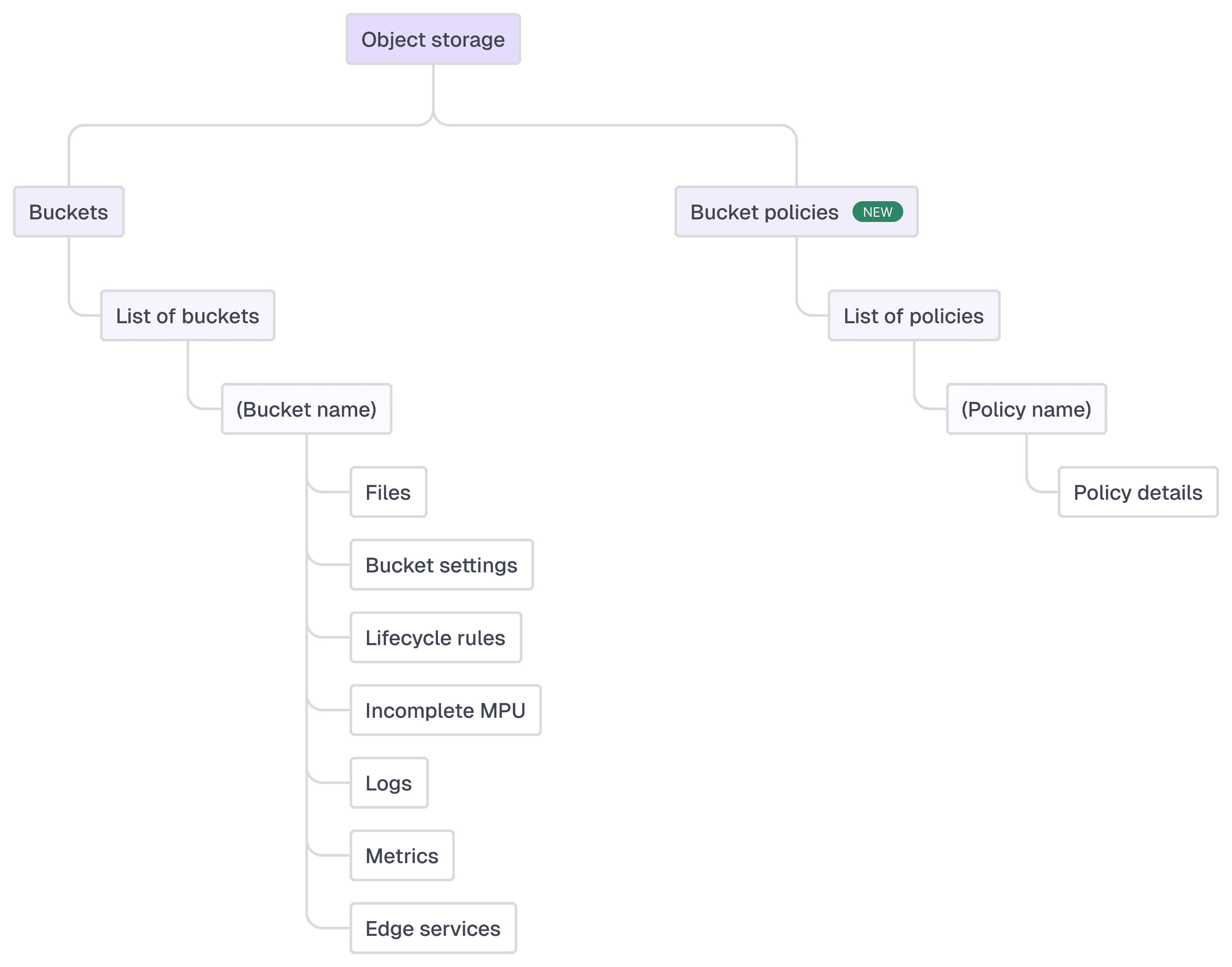
Overview of the Object Storage hierarchy in the Scaleway Console.
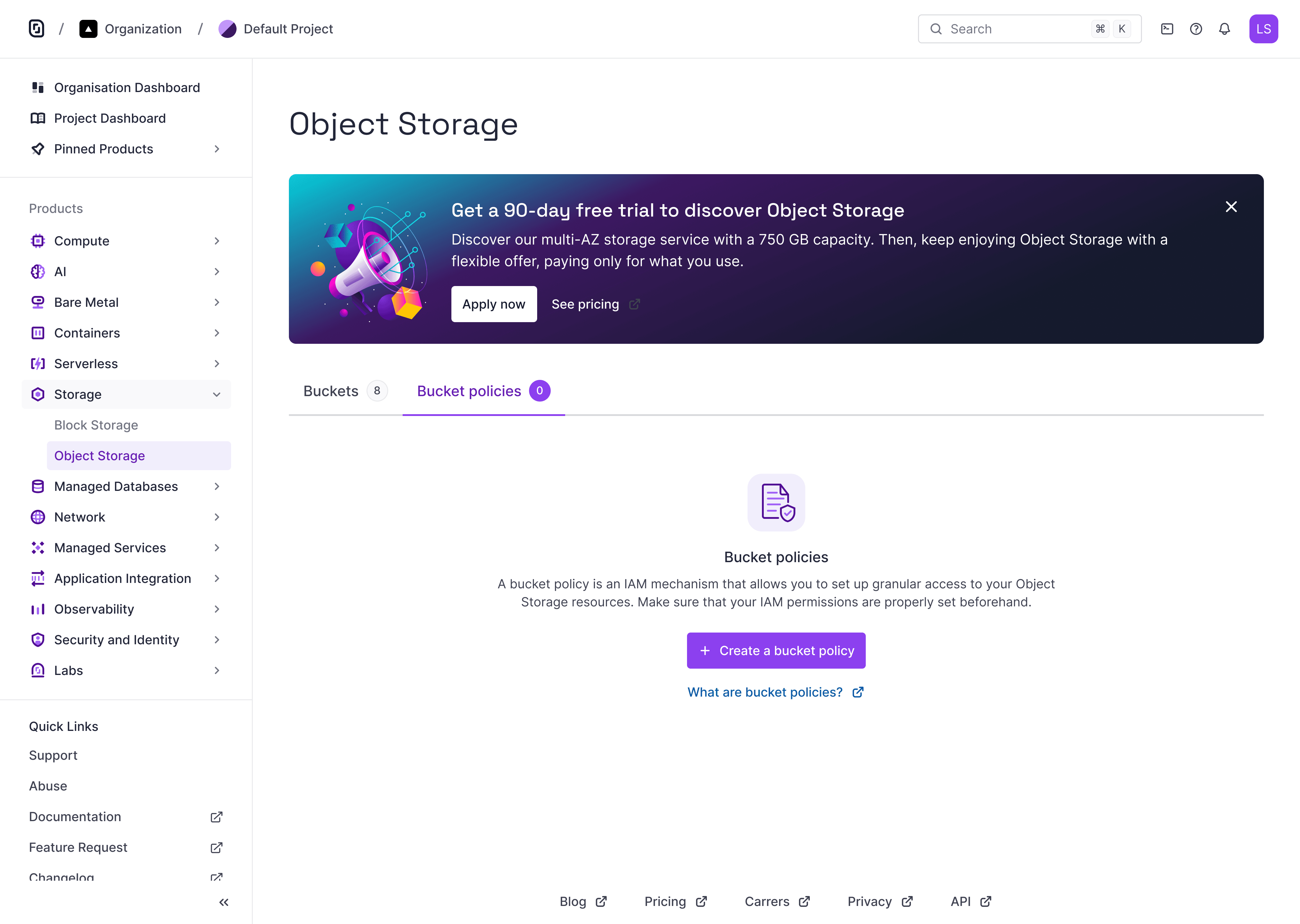
Empty state of the Bucket Policies tab, introducing the feature and inviting users to create their first access control rule.

The new Bucket Policies tab lists all created policies with key metadata and direct access to their targets.
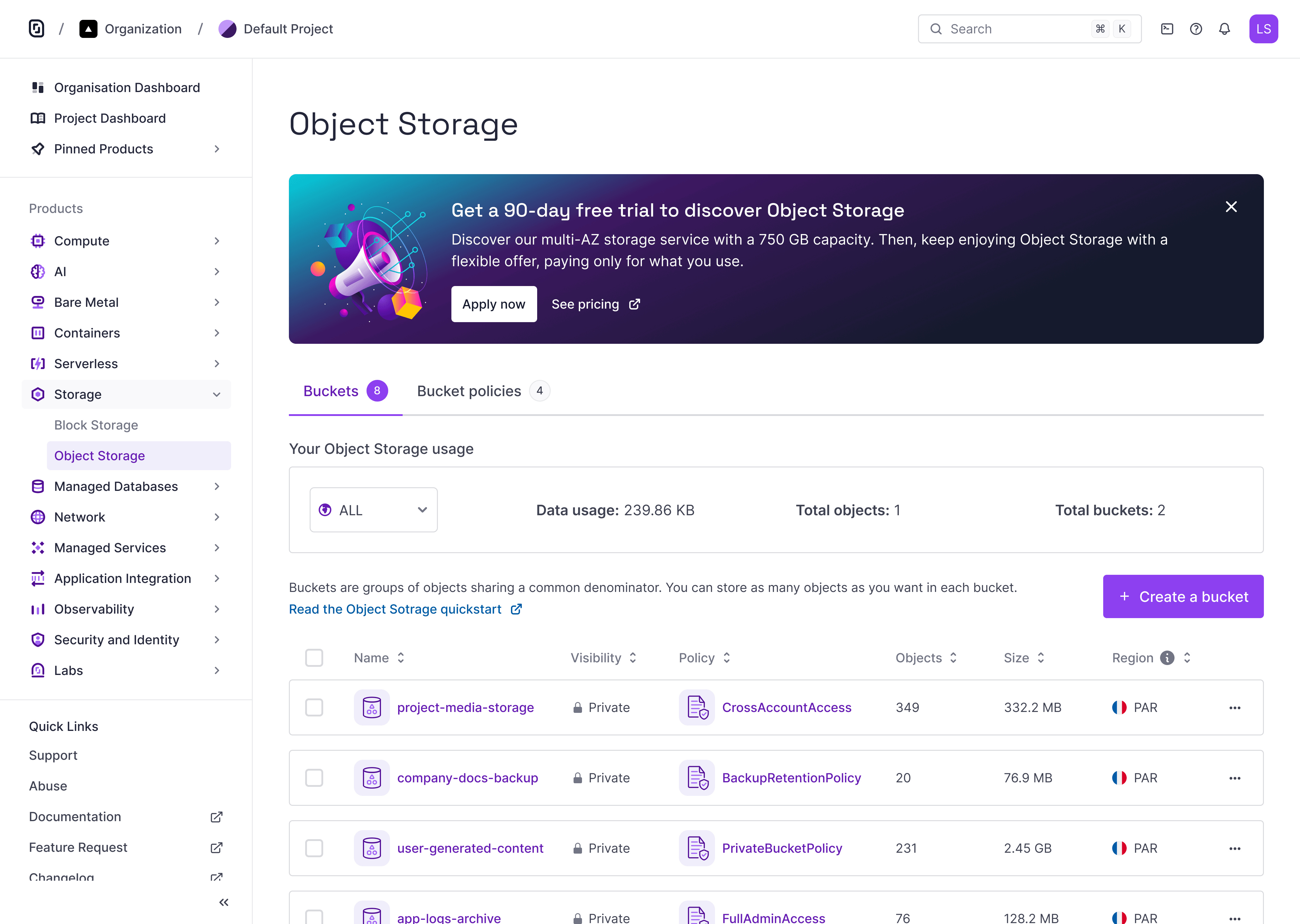
In the Buckets list, each bucket shows if a policy is applied — making access control status visible at a glance.
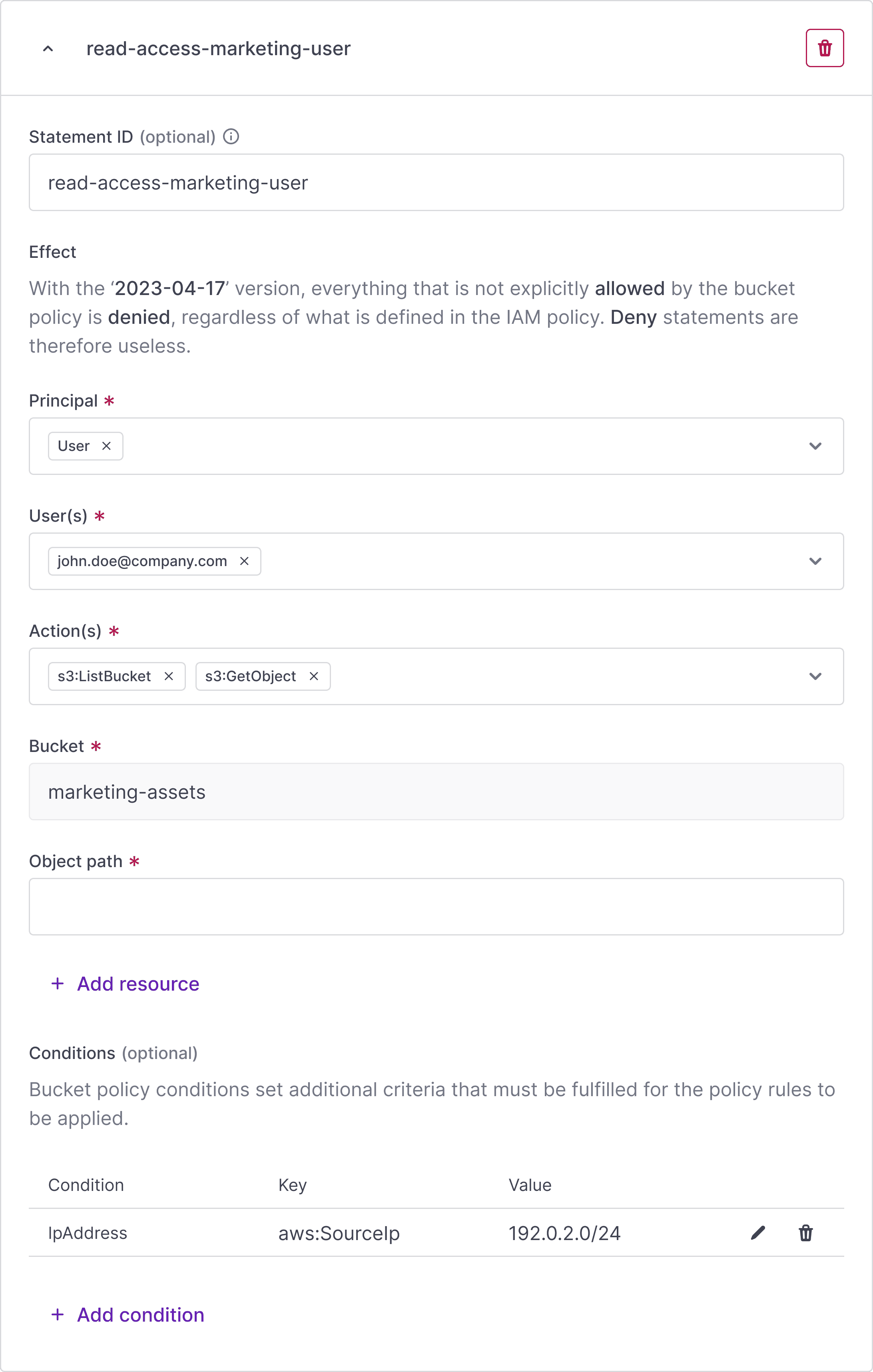
Dynamic form
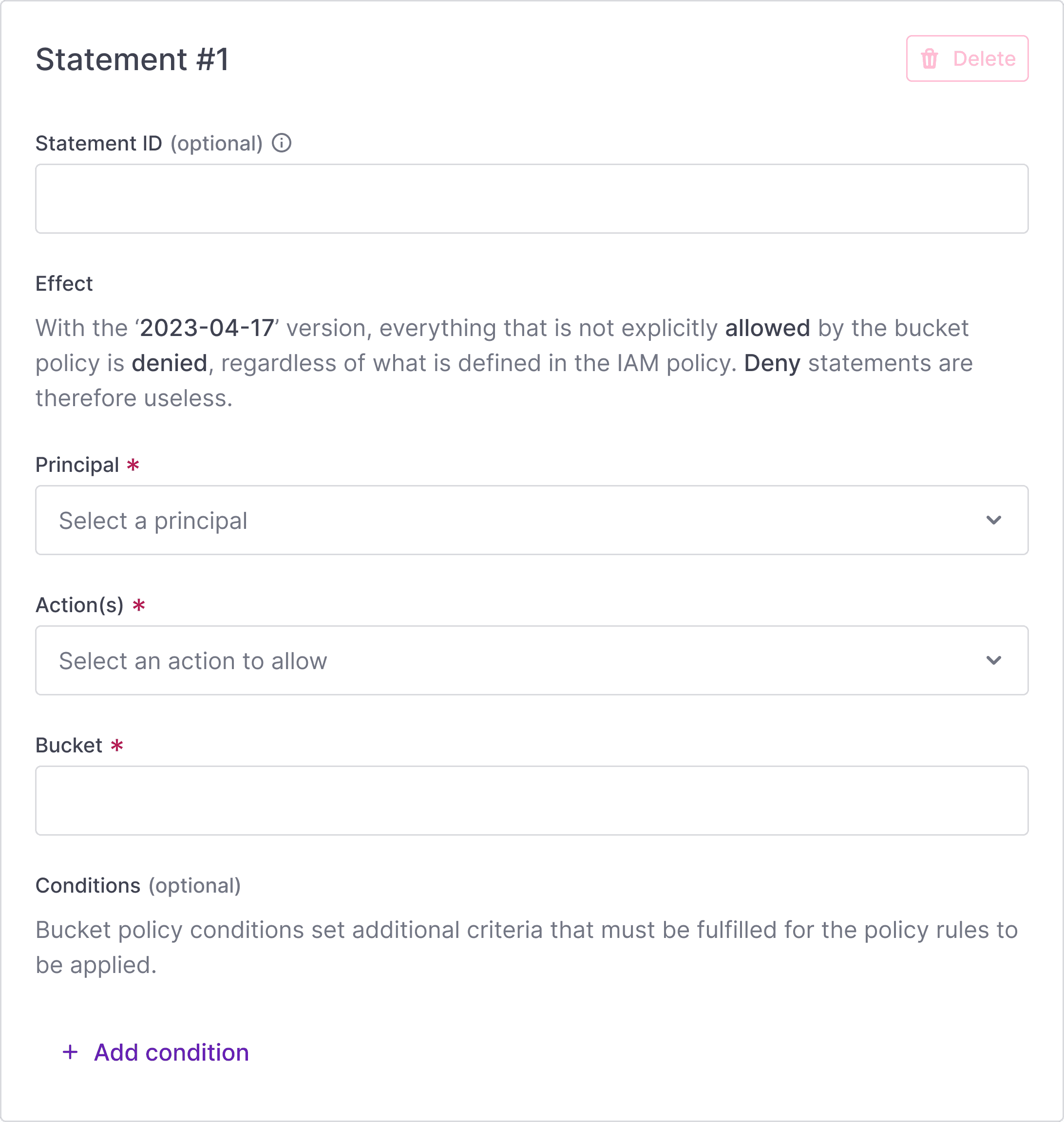
Each access rule is built through a dynamic card that adapts based on user input. We applied progressive disclosure to only show relevant fields when needed.
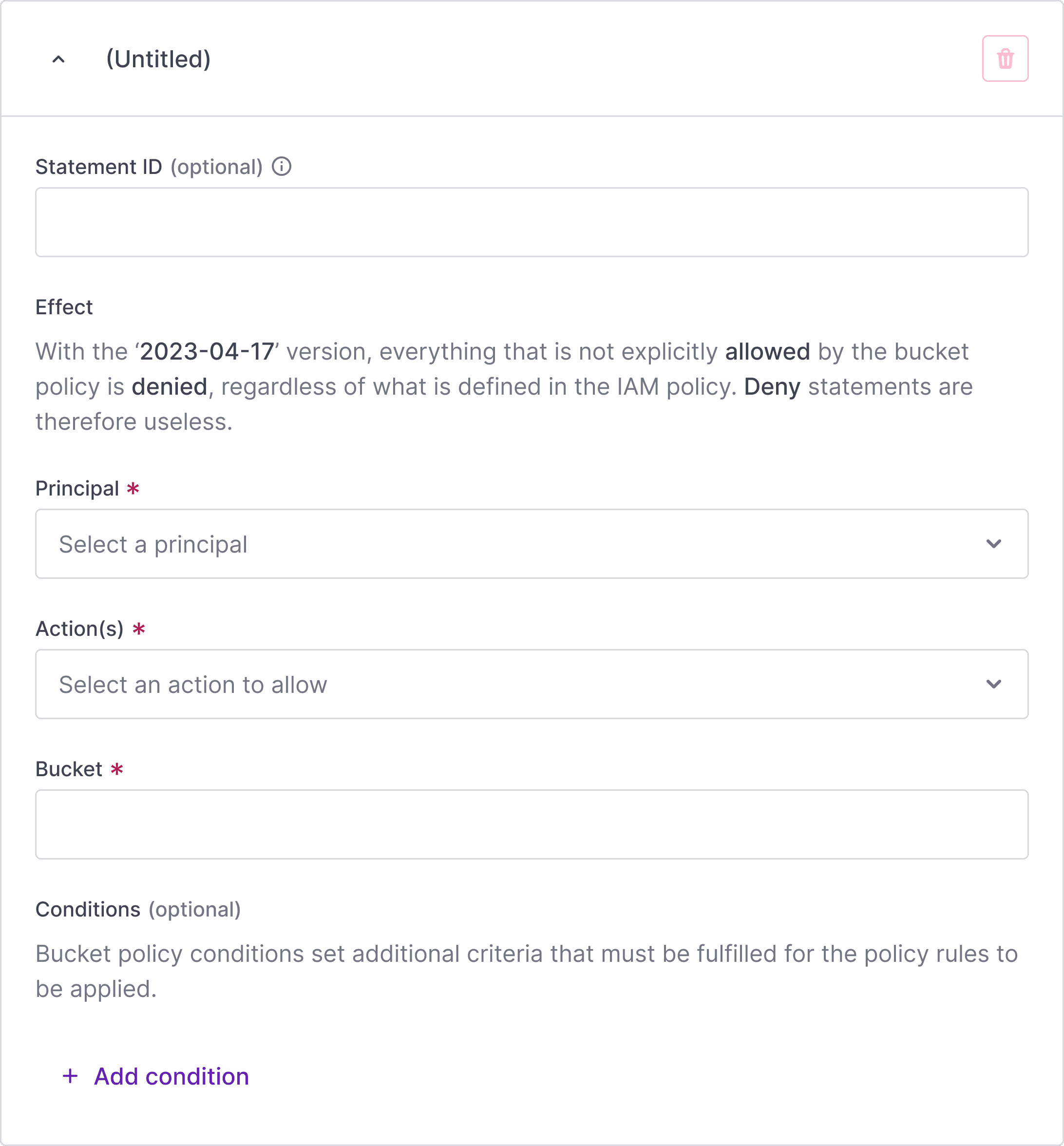
Initial state of a statement card, prompting users to define access rules through a guided form. The form adapts dynamically based on user input.
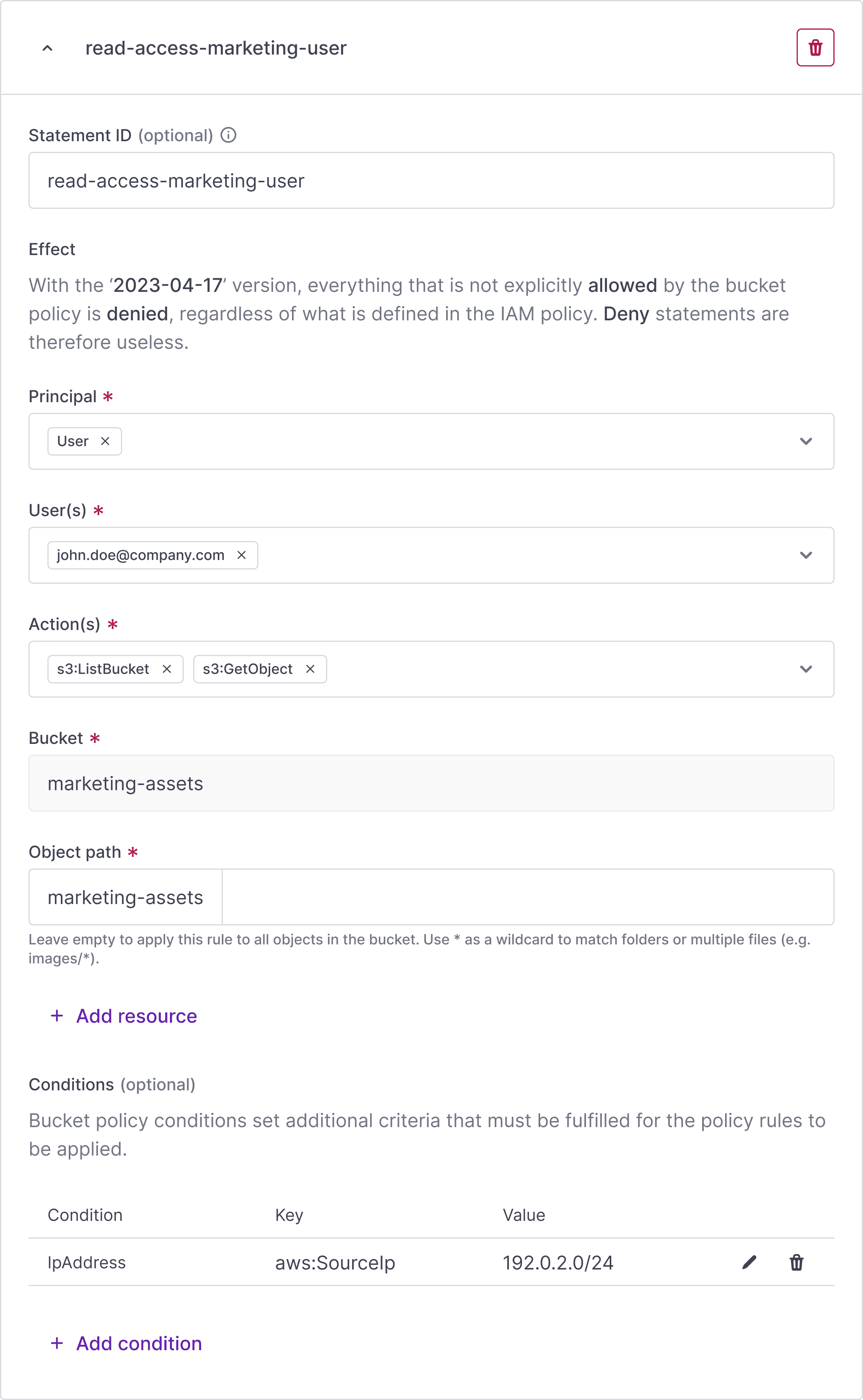
Completed statement form showing a real-world example: a user is granted read access to a specific bucket and object path, with an IP-based condition applied.
Delete button behavior adapts to context: it is active when multiple statements exist, but disabled (with a tooltip) when only one remains, to prevent users from creating an invalid policy.
Advanced conditions
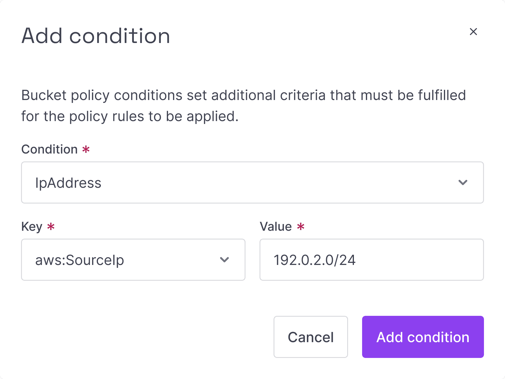
Some users needed advanced controls like IP-based restrictions.
We added a modal with guided key/value inputs—no JSON required.
A checkbox lets users add multiple conditions without leaving the flow, making complex policies easier to build.
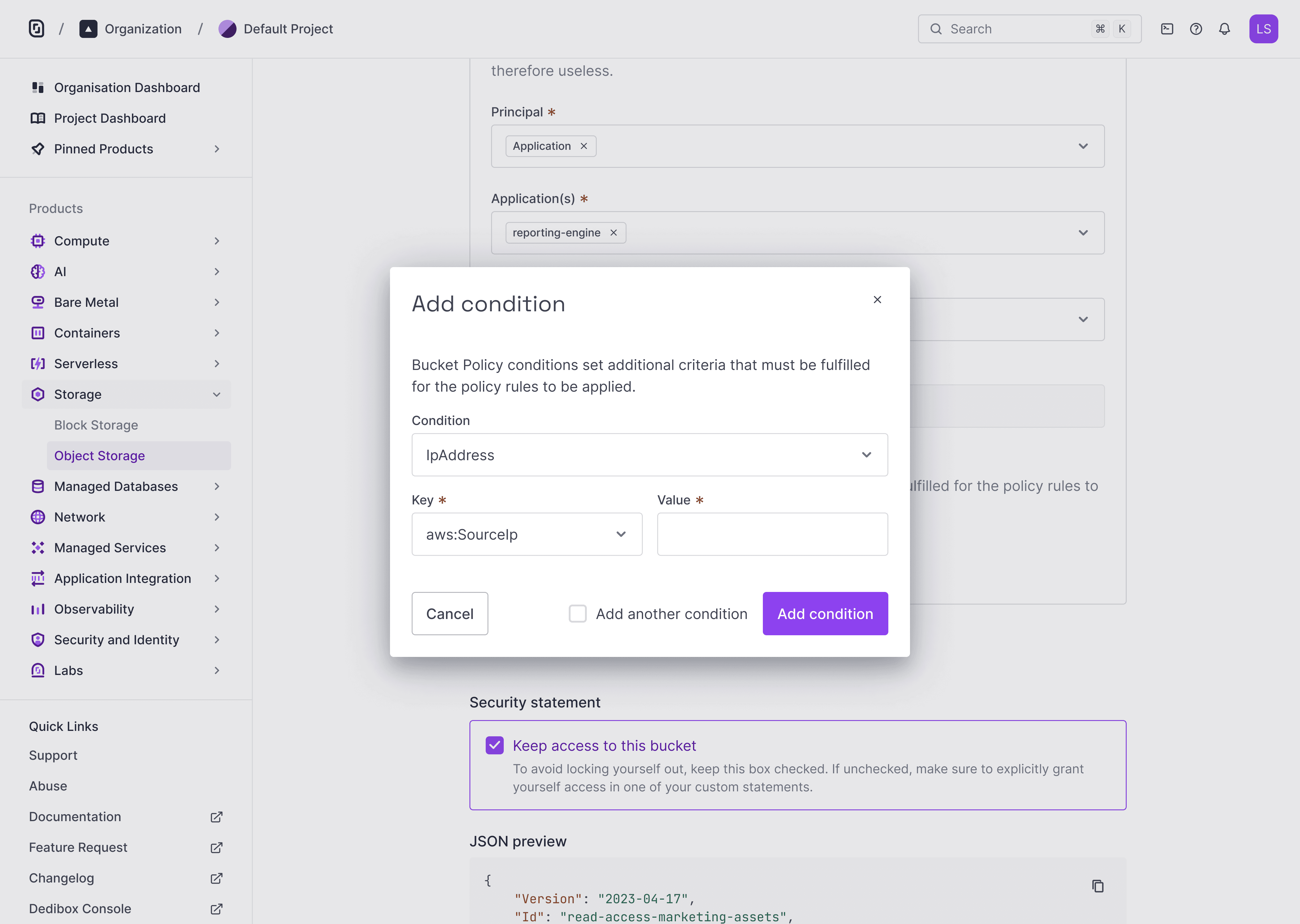
The condition modal lets you add rules like without writing code.
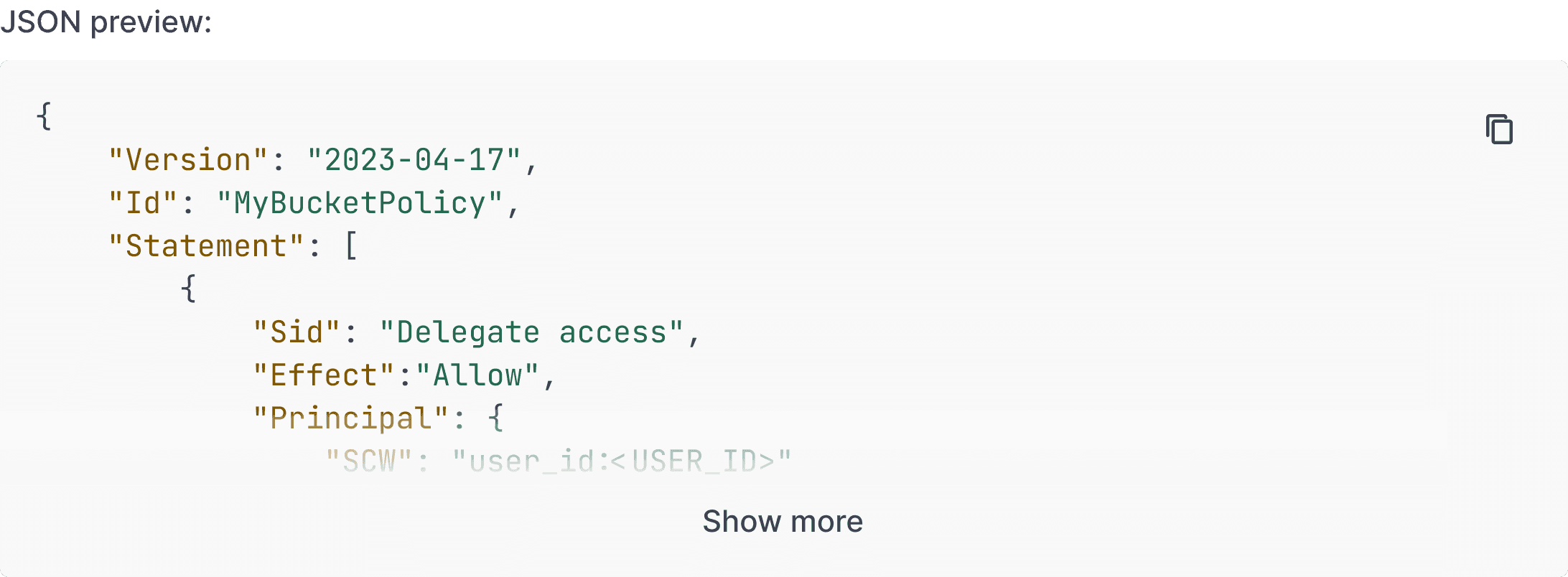
Live JSON Preview
To improve transparency, we added a live JSON preview.
Users can expand, collapse, or copy the generated policy as they build it—making it easier to debug, review, and trust what’s being applied.

The JSON preview keeps everything transparent and easy to validate before applying.
Dual editing mode
Users can switch between a visual form and a JSON editor at any time.
Both views stay in sync, giving flexibility to work visually or in code—without losing context.
This also helps users understand how form inputs map to policy structure in real time.
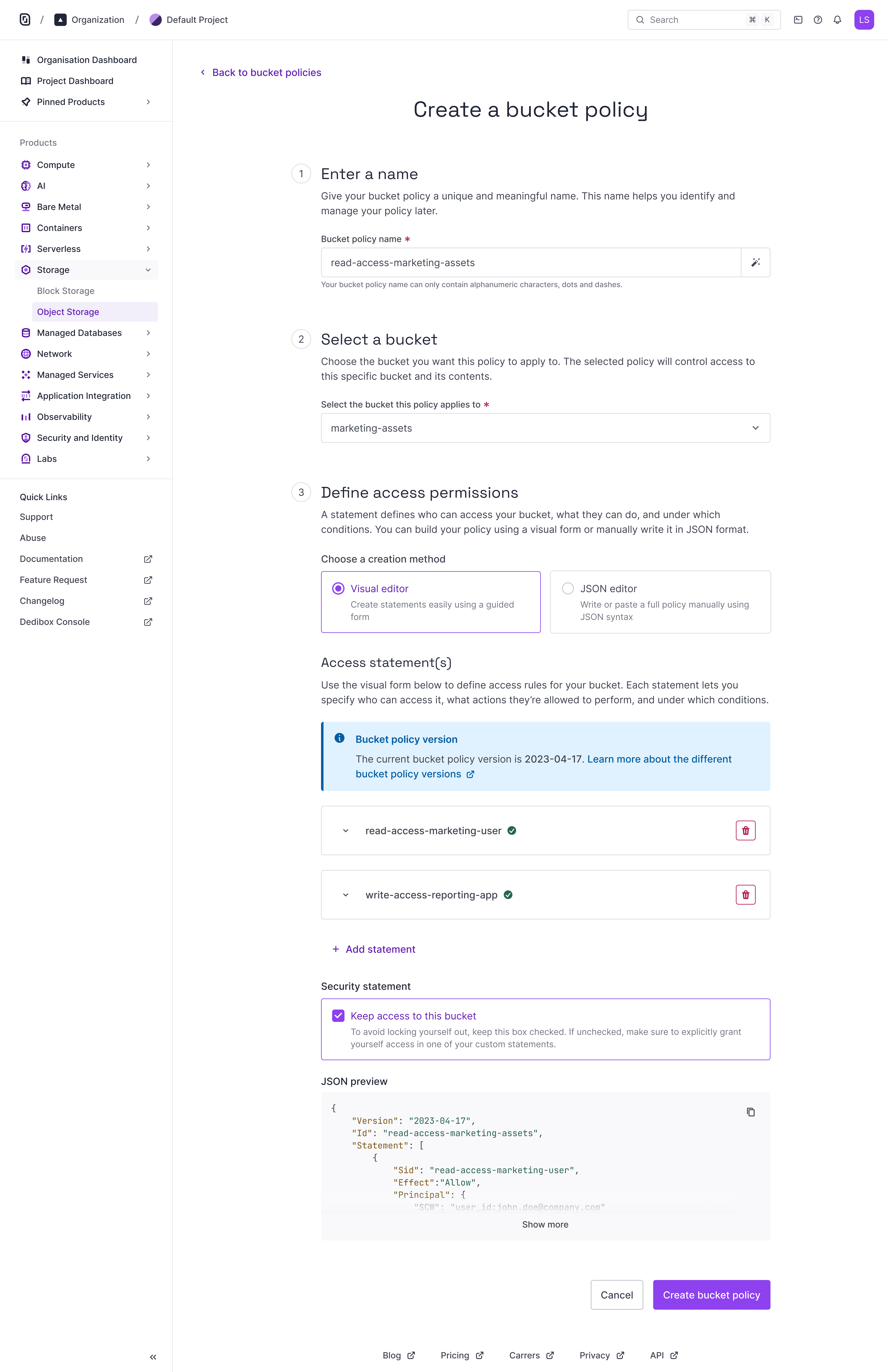
The visual editor allows users to build policies through a guided interface, supporting multiple statements with granular permissions and conditions.
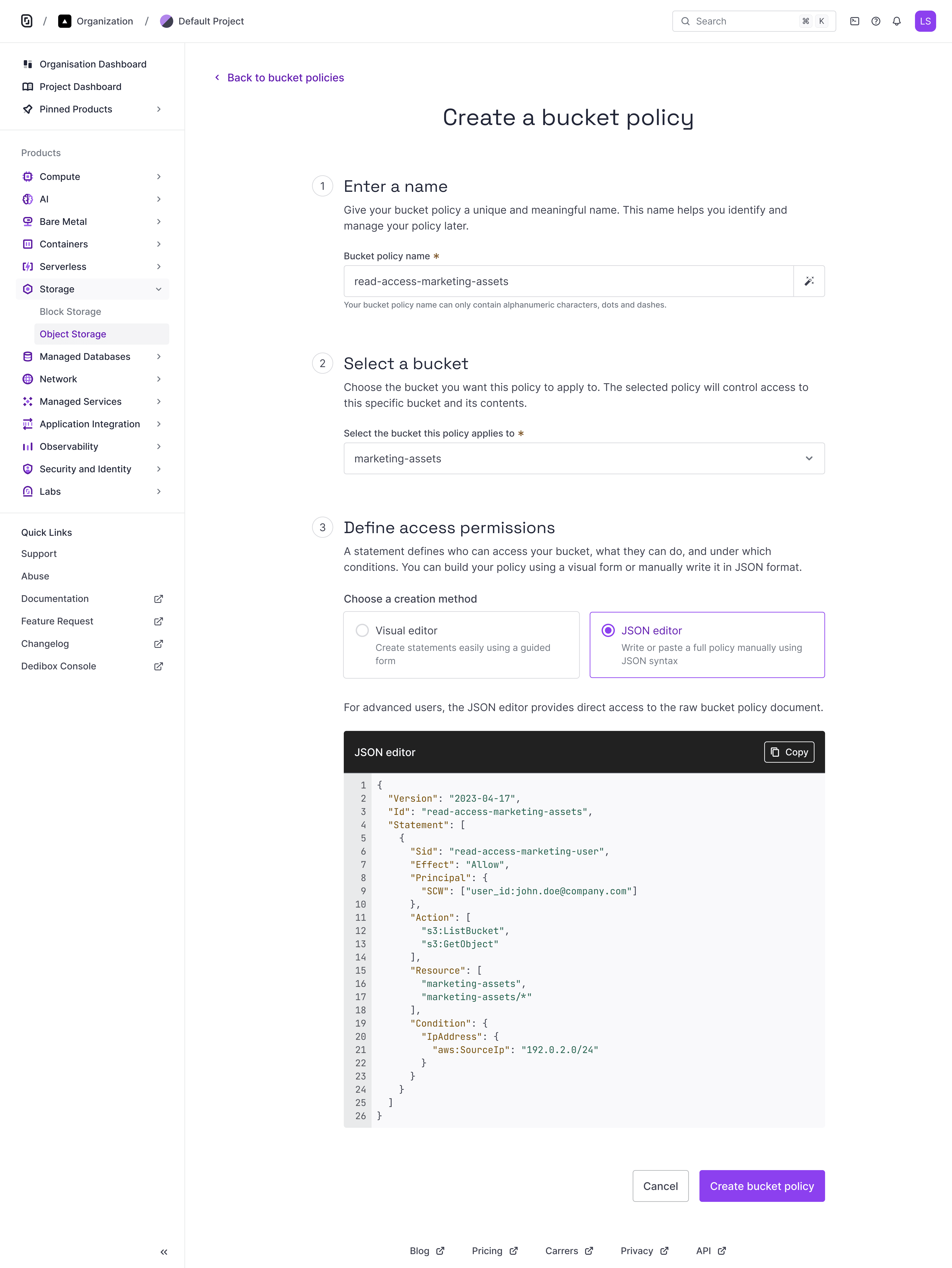
Advanced users can write or paste bucket policy documents directly in the JSON editor, with full flexibility and real-time syntax validation.
Built-in Safeguards
To prevent accidental lockouts, we added a default checkbox: “Keep access to this bucket.”
It ensures the current user keeps access—even if they forget to add themselves.
A simple safeguard that makes the experience safer for everyone.
This checkbox ensures that users don’t accidentally lock themselves out of their own bucket. If left unchecked, users must manually include a statement that grants them access.
Reusable policies
After creating a policy, users access a summary screen where they can review, edit, or reapply it to another bucket. The flow was designed with reuse in mind, helping teams manage multiple buckets without duplication—no templates needed.
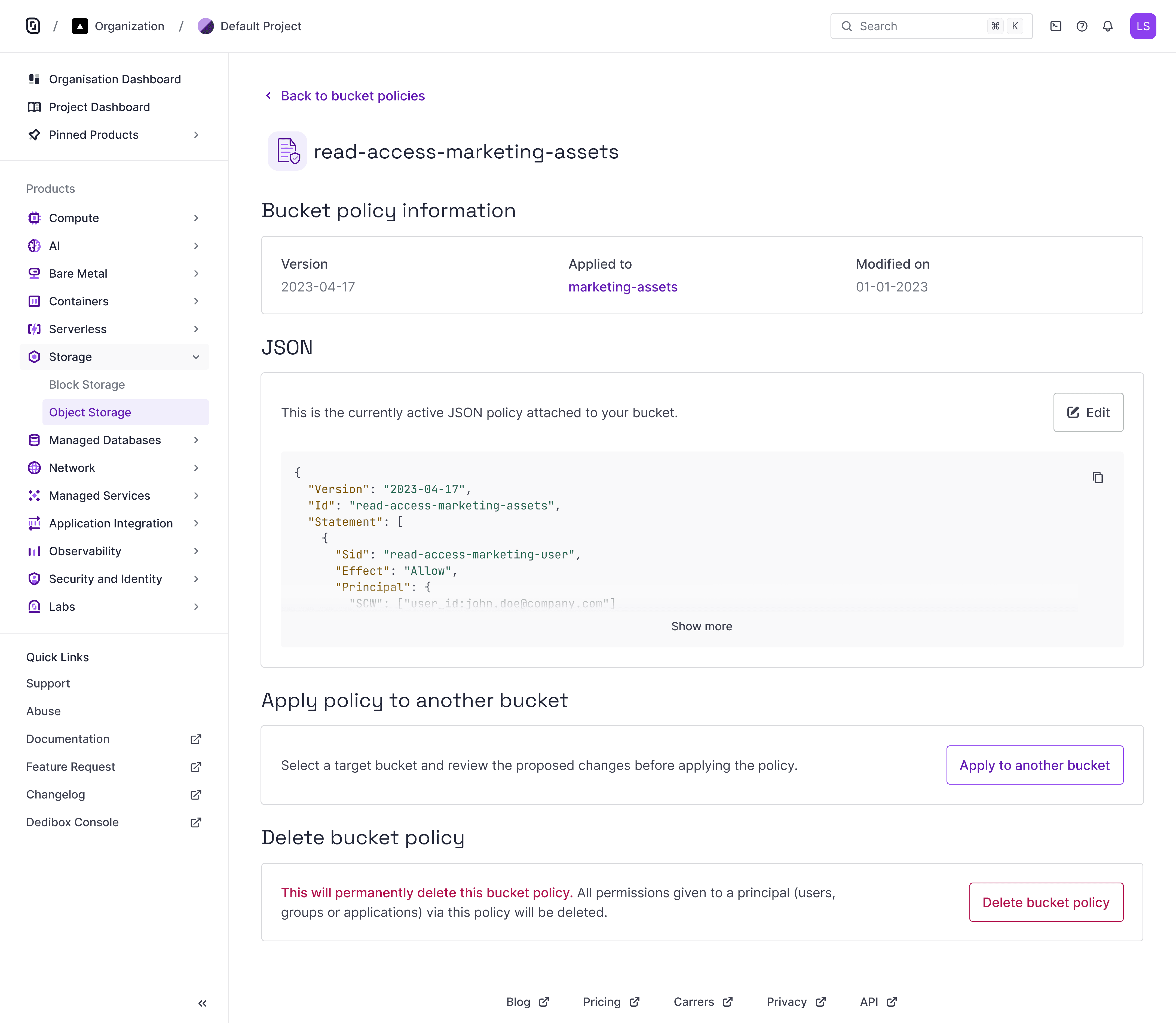
Bucket policy details page with actions to reapply or delete the current configuration.
Design system contribution
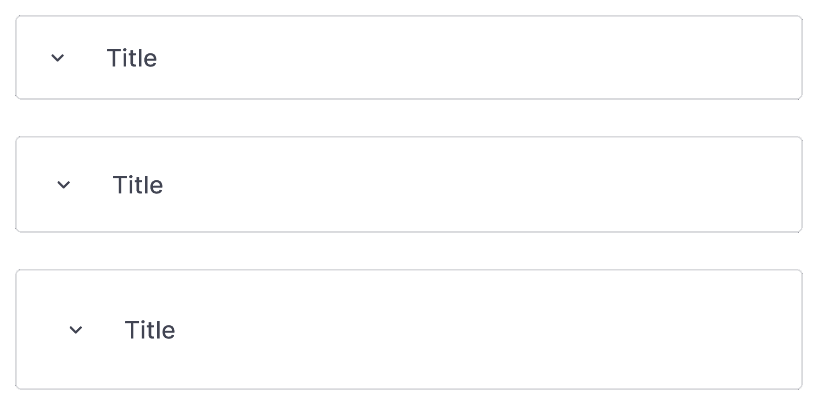
To support multiple access statements, I designed the ExpandableCard component as a reusable pattern. It allows users to collapse content, label each card, edit inline, and see validation at the right level.
Built with scalability in mind, it’s now documented and reused across other parts of the product.
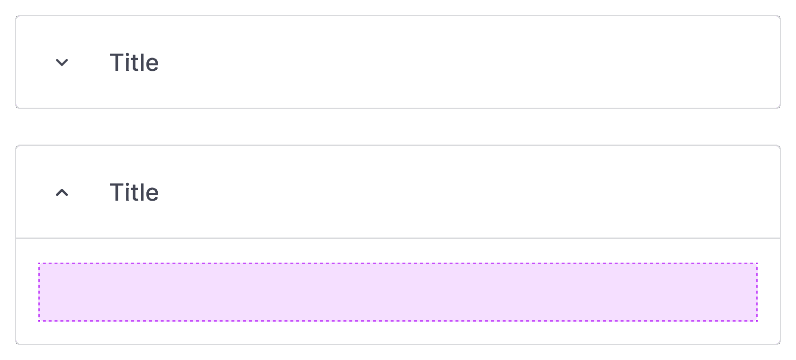
ExpandableCard supports progressive disclosure by letting users collapse or expand content, reducing visual overload in complex forms.
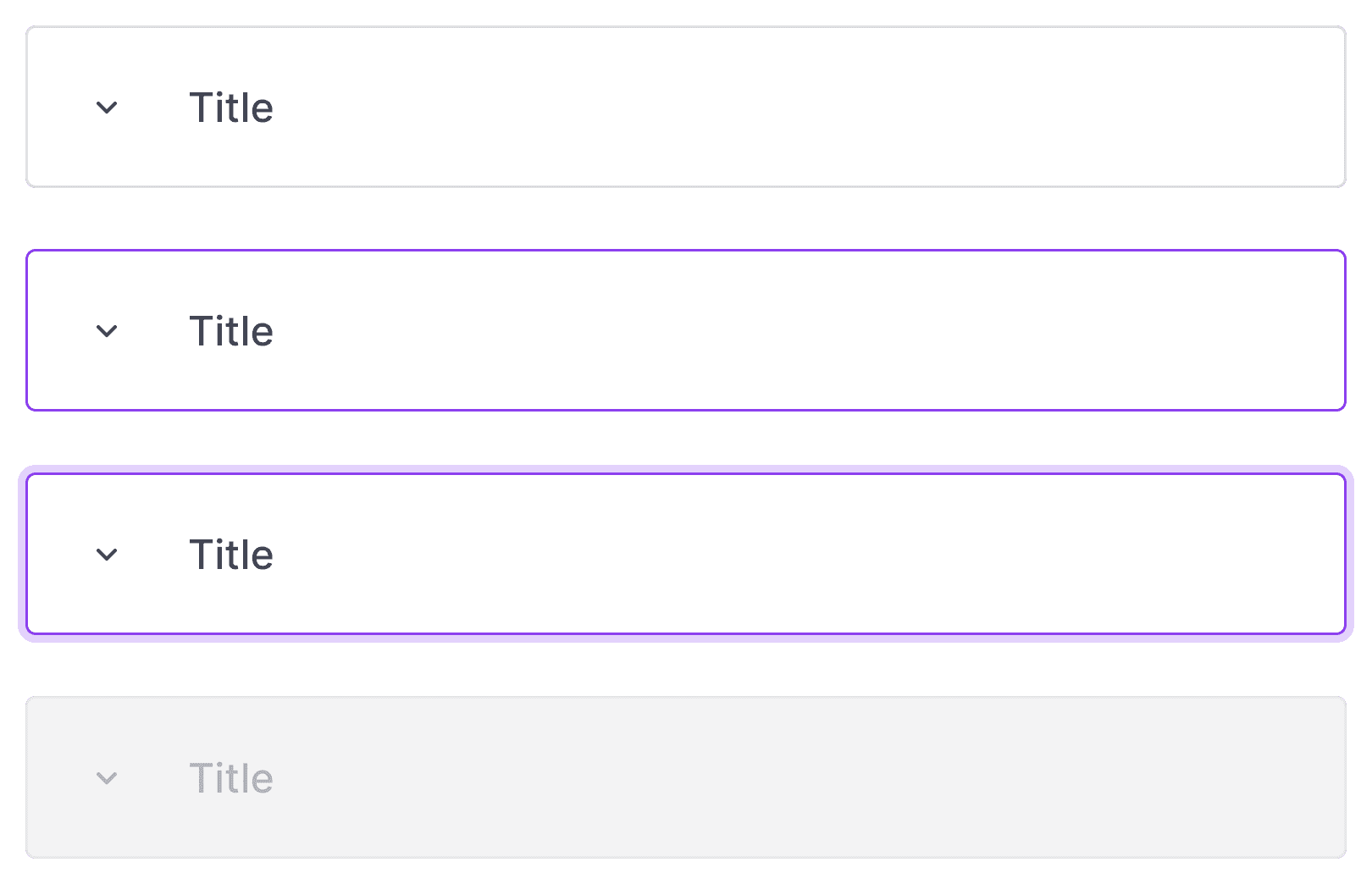
Designed with accessibility and responsiveness in mind, the component includes all necessary interactive states for consistent UX across products.
To ensure flexibility across different use cases, the component is available in three predefined sizes aligned with our spacing system.
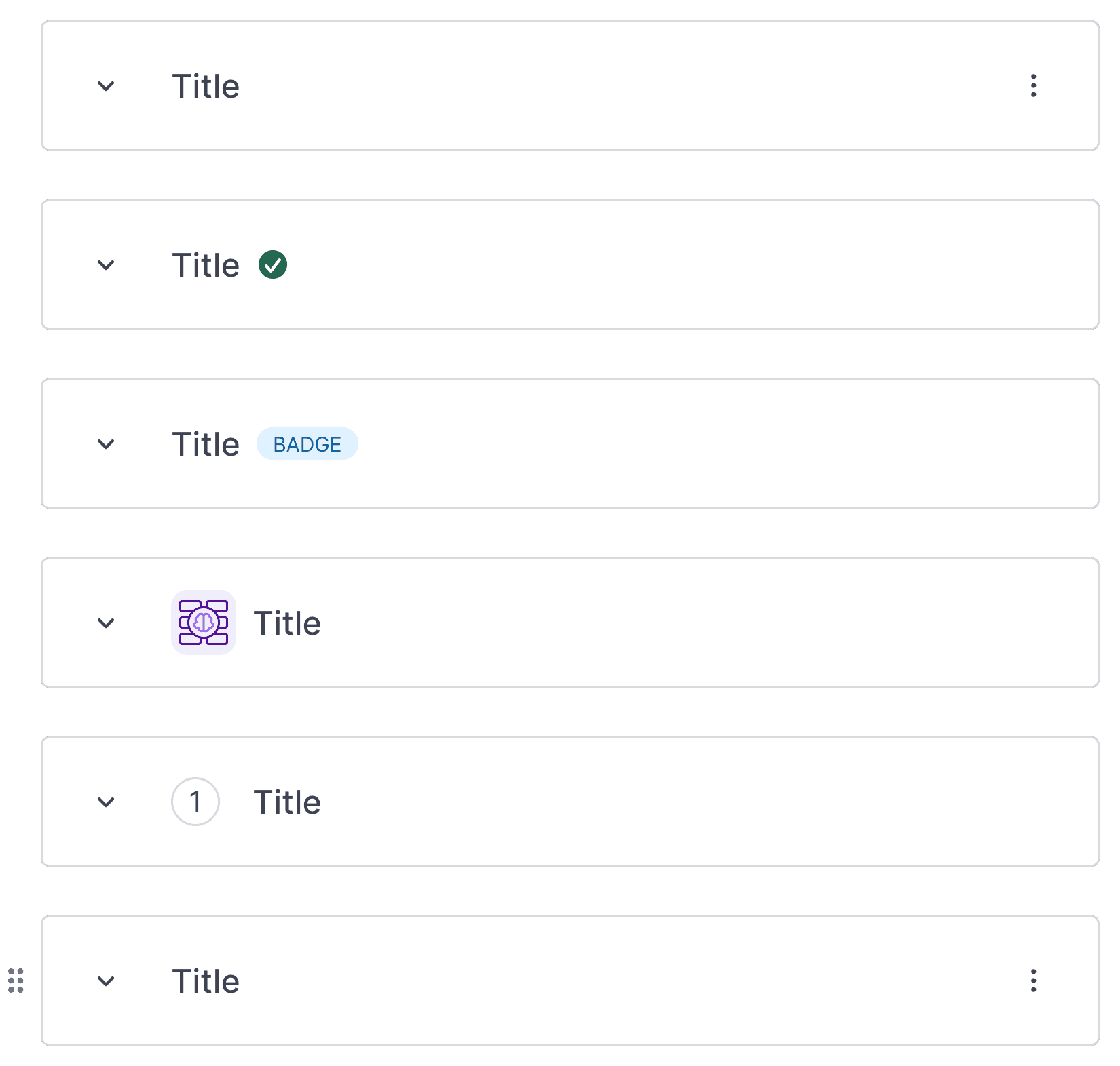
The component supports a variety of optional elements: status badges, validation indicators, and secondary info, making it adaptable for many contexts.

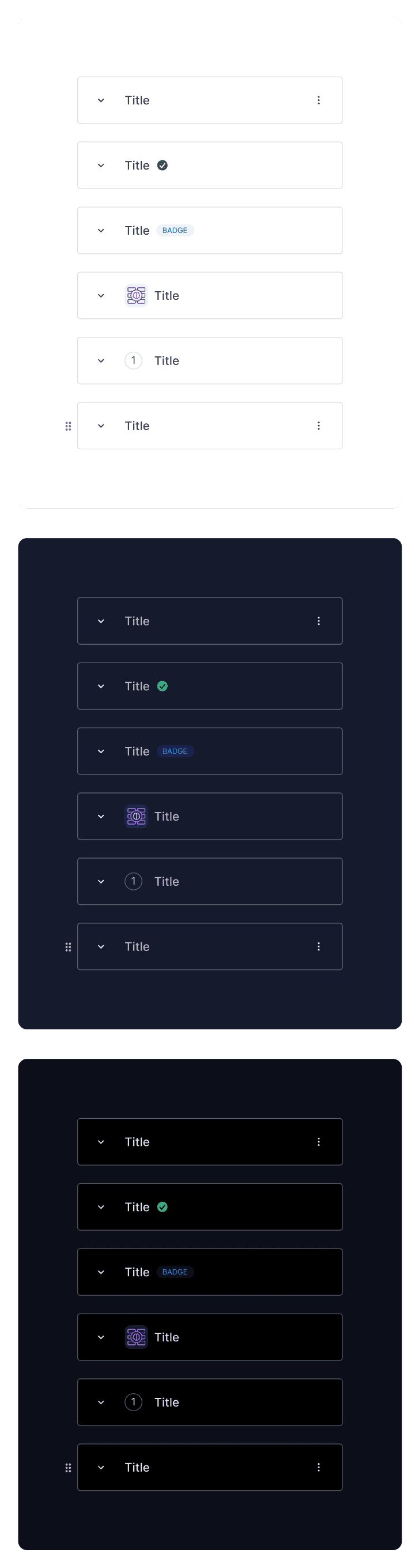
Preview of the statement card across light, dark, and darker modes, designed for consistency and readability in all environments.
A pragmatic approach: shipping first, scaling after
To ship on time, we started with a basic card layout—no collapse, no reusability. It worked, but became hard to scan with multiple statements. After launch, we introduced a proper component to reduce clutter and improve navigation.
Custom statement card
Scalable component-based layout
Initially, statement cards were static — it did the job, but the long page wasn’t scalable.
To reduce visual noise and improve scanability in a dense layout, we chose to display only the delete icon on each statement card, with a tooltip for clarity.
Early user feedback
After the initial design explorations, I created a prototype to validate the user flow. We ran a series of internal testing sessions with 6 users to surface early friction points and test key assumptions. These sessions helped us quickly identify areas that needed refinement before moving forward.
User satisfaction
4.2 / 5
Usability feedback #1
Syncing matters
Users wanted both modes to stay in sync.
But those using the form found it annoying to switch views just to check the JSON.
What we did
We added a real-time JSON preview below the form.
No need to click or switch views to see what’s being generated.
This code snippet displays the generated policy in real time, with options to expand, collapse, and copy — helping users review and validate their configuration.
We added the code snippet under the statement builder to show the generated policy in real time.
Usability feedback #2
Repetition is frustrating
Users found repetition frustrating.
They had to retype the bucket name when selecting object-level actions.
What we did
The bucket is now pre-filled in the object path.
This reduces effort and avoids input errors.
V1
V2
The object path field is now prefilled and contextual, reducing manual input and potential errors when setting object-level actions.
Usability feedback #3
Conditions take too long to add
Adding multiple conditions felt too long.
Users had to repeat the same steps each time.
What we did
We added a checkbox in the modal: “Add another condition”.
It keeps the modal open, so users can chain conditions faster.
V1
V2

We redesigned the modal to reduce friction when adding multiple conditions. Users can now stay in flow with an “Add another condition” option.
Usability feedback #4
Deleting felt risky
Deleting a statement felt risky.
Users wanted more friction to avoid mistakes.
What we did
We added a confirmation dialog before deletion.
And disabled the delete button when only one statement remains.
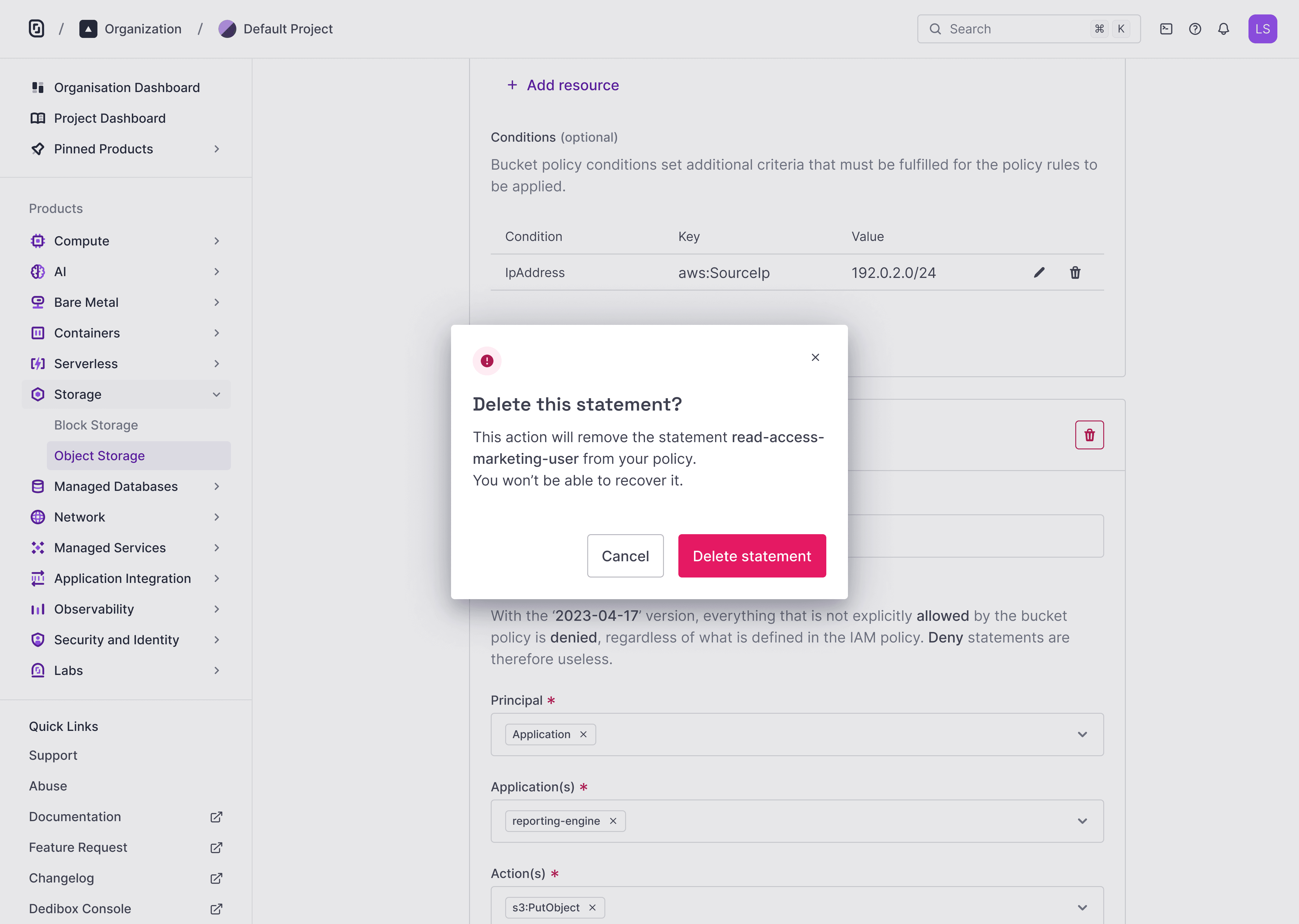
Before removing a statement, users must confirm their action. This extra step adds friction to prevent accidental deletions.
Results and impact
30% of Object Storage users created a bucket policy within the first 3 months.
Support requests related to access control dropped noticeably.
We closed a key gap by bringing fine-grained access control to the console.
These results validated both the product direction and the execution.
Final thoughts
Designing access control means balancing flexibility with safety.
This project helped us:
Make technical rules easier to understand
Reflect complex logic through simple UI
Lay the groundwork for stronger IAM features
If I could revisit one thing, I’d involve real users earlier—especially security-focused teams.
It would have helped validate our assumptions, naming, and edge cases more thoroughly.