Loanscape Design System
Redesigning CA-CIB’s Design System to drive consistency and speed.
Certain visual examples are currently missing. They’ll be added shortly to give a clearer view of the system in action.
Summary
This case study explains how we rebuilt the internal design system used by teams working on CA-CIB’s Loanscape program. The previous system lacked structure, consistency, and adoption. Components were duplicated, documentation was missing, and collaboration between designers and developers was uneven.
We redesigned the system from the ground up: auditing the existing assets, defining a clear token structure, rebuilding components, and enabling contribution across teams. The new system improved accessibility, reduced design inconsistencies, and helped product teams deliver UI work 40% faster.
Timeline
June 2022 - March 2023
Team
1 Design System Designer, 1 Delivery Manager, 3 Engineers
Role
Design System Designer — led the full design system revamp: from auditing components and aligning foundations, to designing scalable tokens, documenting usage, enabling contribution, and supporting developers across multiple teams.
Key results
Reduced UI inconsistencies and improved design consistency across internal tools
Cut design-related development issues by 40% within the first year
Strengthened accessibility and design feedback loops across product teams
Context
I joined CA-CIB as a consultant Product Designer, initially to support the design of an internal tool. But once there, it became clear that several teams working on internal apps for the Loanscape program were facing broader design challenges. They lacked a shared system, and the existing design system was underused and poorly structured. The team needed someone to take ownership and rebuild it. Even though it was my first full-time role on a design system, I took on the challenge.
What is Loanscape?
Problem
Each team had its own way of working, which led to inconsistent interfaces across internal tools. Designers recreated components on their own, without shared guidelines or contribution rules. There was no real documentation. Developers lacked clear specs, and users had to relearn how things worked from one tool to another. These gaps didn’t just impact design—they slowed down collaboration, made scaling harder, and hurt the overall user experience.
Objectives
The goal wasn’t just to clean up Figma. We wanted to fix real issues teams were facing and make the system useful from day one.
Here’s what we set out to do:
Bring clarity and consistency to internal tools used across the Loanscape program
Help product teams work faster by providing ready-to-use components
Improve accessibility and reduce design-related issues
Make the design system easy to adopt, contribute to, and maintain
Align designers and developers around shared rules and foundations
My role
I led the design system work from end to end. That included the audit, prioritization, component design, documentation, developer support, user testing, and design ops tasks like contribution workflows and process alignment. During the research phase, I worked with another designer to interview team members and review real project files. I collaborated daily with three front-end developers and a delivery manager to align on how components should behave and be implemented. I also stayed in close contact with five other designers, each supporting a different product team, who helped test components and validate them in context.
User research
Before jumping into design, I needed context. I worked with another designer to audit existing components, foundations, and patterns—not just in the shared library, but also across real project files, where many components had been detached or rebuilt. We also interviewed designers, developers, product managers and users to understand their pain points. Each team had different issues, but they all pointed to the same core problems.
Here’s what we found:
Key finding #1
Duplicate components
Teams rebuilt the same elements with small differences.
There was no central reference or documentation.
Key finding #2
Inconsistent accessibility
Contrast issues, font sizes, and icon-only actions were common.
Most didn’t meet basic accessibility standards.
Key finding #3
No design rules
Designers lacked shared guidelines.
They worked around problems instead of solving them together.
Key finding #4
Missing specs for Devs
States and behaviors weren’t clearly defined.
Developers had to guess or ask around.
Key finding #5
Lack of alignment
PMs had trouble keeping squads on the same page.
It slowed things down and led to rework.
Key finding #6
Fragmented UX
Users had to relearn how things worked from one tool to another.
Even basic tasks felt different between products.
This wasn’t just about design quality. It was about scale, collaboration, and user experience.
We needed a system that could bring structure and clarity to all of it.
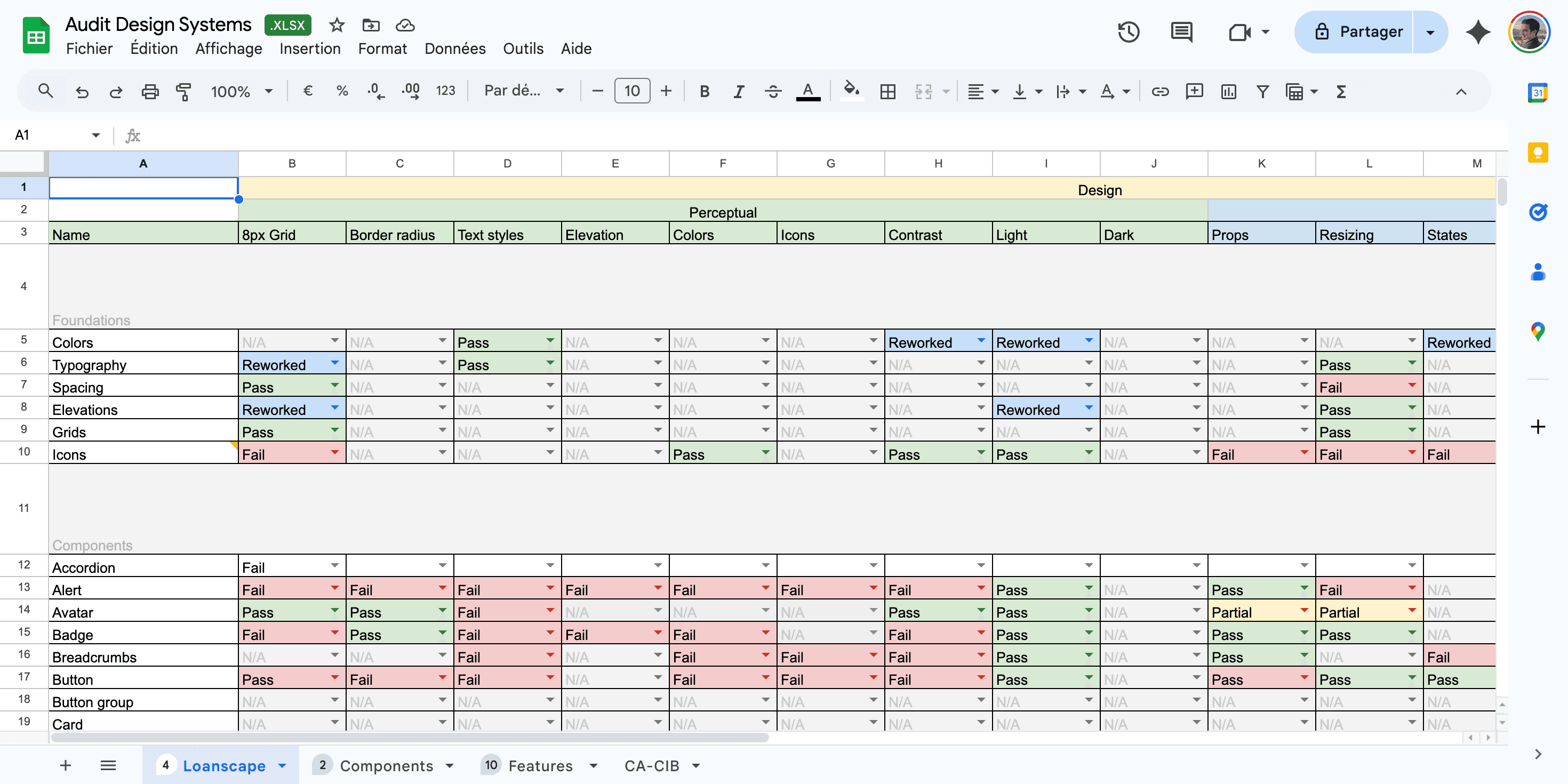
Component audit spreadsheet — Visual overview
To get a clear view of the system, I ran a full audit using an Excel template I found online. Each component was reviewed against a set of criteria we defined as a team: grid, spacing, colors, accessibility, states, and interactions. We marked each one as Pass, Fail, or Reworked. The result was easy to share and understand, even for people not familiar with Figma. It helped us spot inconsistencies fast and prioritize what to fix.

Initial state of a statement card, prompting users to define access rules through a guided form. The form adapts dynamically based on user input.
Building the foundation
The design system wasn’t starting from scratch. Some foundations and brand guidelines were already in place, which helped set the basics. We focused on four priorities: define a clear visual language, build accessible components, create usable documentation, and align with tech constraints for gradual rollout. We shared work early, collected feedback, and iterated as a team. Nothing was designed in isolation.
Driving adoption
A design system only works if people use it. To make sure teams adopted Loanscape, I focused on three things:
Clarity
Each component came with clear documentation, real examples, and edge cases.
Reliability
We worked with developers from the start.
Everything we designed had to be easy to build and maintain.
Support
I ran workshops, prepared onboarding kits, and helped teams one-on-one.
I wasn’t just delivering components. I was there to help people use them.
The goal wasn’t just to build a system. It was to make sure people felt confident using it.
Challenges
This project came with real constraints. Here’s what we had to work around:
Material Design stack
Our front-end was built on Material-UI.
We had to follow its structure and limits, even when it didn’t match our ideal UX.
Different user needs
Internal teams had very different workflows.
Some were advanced, others less so.
We had to stay flexible, without losing consistency.
Custom documentation tool
Our docs lived on an internal platform.
We couldn’t update it alone.
We needed developer help, which slowed things down.
So we kept the first version clear, simple, and easy to maintain.
We didn’t fix everything at once.
But with feedback, collaboration, and small wins, we made steady progress.
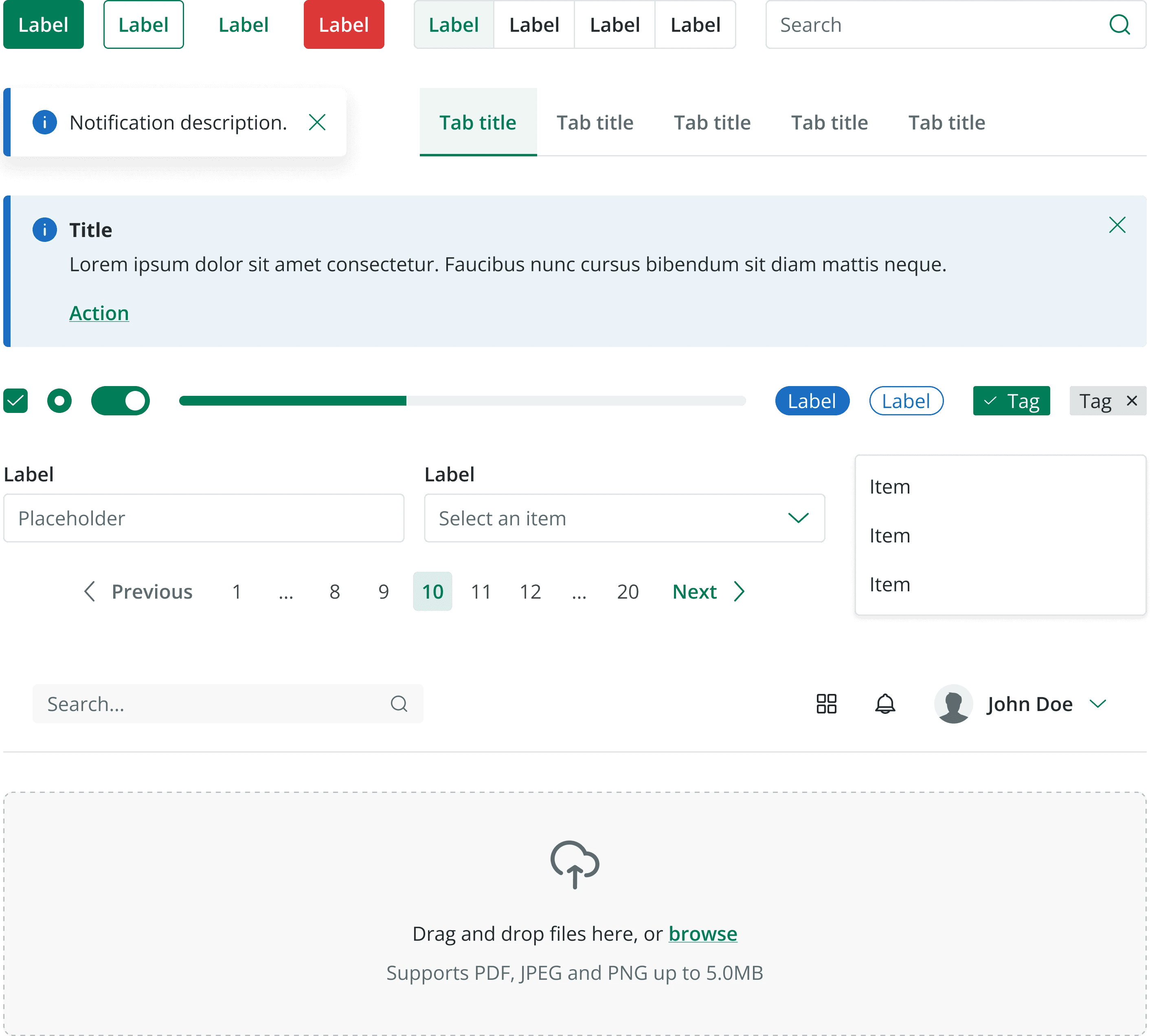
Try it live
A live preview of the system in action. Test components, switch states, and see how interactions behave in real time.
Label
Label
Label
Label
Label
Label
Label
Label
Option A
Option B
Option C
Option A
Option B
Option C
Option A
Option B
Option C
Label
Label
Label
Label
*
Item A
Item
Item
Item
Label
*
Placeholder
This is a hint text to help user
Results and impact
Reduced UI inconsistencies and improved design consistency across internal tools
Cut design-related development issues by 40% within the first year
Strengthened accessibility and design feedback loops across product teams
Internal teams gave better feedback and reported a smoother experience
Takeaways
This was my first full-time role on a design system.
I didn’t have all the answers at the start, but I learned fast.
Here’s what stuck with me:
A design system only works if people are aligned
Clear documentation is essential for adoption
Early collaboration with developers prevents friction
Empathy helps you design for different team realities
Sharing work early leads to better decisions
Final thoughts
If I could go back, I’d probably do a few things differently:
I would have communicated more widely to give the team and its work more visibility
I would have pushed for a tool like Zeroheight to manage documentation without relying on developers
I would have designed some things differently—but in this kind of setup, you learn to work with real constraints
This project taught me to stay flexible, focus on impact, and make the best out of what’s possible.